Ember Application

Mobile App Design | Interaction Design Studio (University of Michigan School of Information)

PROJECT OVERVIEW

The Project

    By empowering users with information that is often overlooked and facilitating in-person discourse, my team and I believed we could create a platform that allows people to unite through their local government and ultimately be more effective citizens. Our solution was an iOS application called Ember that facilitates in-person events, helps people find local candidates, and stay updated on important topics.

The Problem

    An uniformed voter who feels uncertain about voting in local elections needs to engage with their community through in-person discourse to gain knowledge about politics but faces (scarcity of events within the community or information overload in trying to find events and facts about politicians). 

The Outcome

   We created a prototype of an iOS  app that facilitates in-person events, helps users find local candidates, and stay updated on important topics. We display these instances in a single-view card format to give focus and depth to them.

The Team

  • 6 UX Designers

Timeline

September 2018 – December 2018

The Process

1) Project Background

Problem Statement

    Regardless of your viewpoints, if there’s one thing that the recent American presidential election made clear, we need to be more active participants in maintaining our democracy. This is particularly true for local and state elections that are often overlooked in importance. These smaller elections (compared to the presidential elections) are much more impactful in our day-to-day lives. For example, the cost of living and school quality is controlled by local laws.

    Our group’s first goal is to understand why there is a lack of discussion and knowledge of regional elections, candidates, and policies. Once we understood the root of the issue, we could then move on to our next goal of creating a platform that can facilitate discussions and inform citizens about regional politics. We believe that by promoting bipartisan discussion and disseminating unbiased information, we can create a platform that would allow users to mobilize themselves more effectively.

    Features will include a policy matching algorithm, meetup style discussion planner, and information on candidate’s ideologies and policies. A policy algorithm will allow users to enter their preferences and see how local candidates align with their values. Finally, our tentpole feature will facilitate dialogue amongst voters to help increase empathy and perspective. We are attempting to strengthen ties within the community by physically and mentally uniting members. In-person meetups can more effectively achieve this than digital communication, which is often riddled with a distinct lack of empathy. Lastly, assimilating information on candidates from a spectrum of news sources will allow users to get a comprehensive understanding of social issues and political agendas, thus creating an informed user.

    By empowering users with information that is often overlooked and facilitating in-person discourse, we believe we can create a platform that allows people to unite over their local government and ultimately be more active citizens.  

2) Research

Competitive Analysis

    Uniformed voting has consistently been a massive problem in the US, and because of this, the problem design space has begun to fill up with companies and services attempting to create a solution. When searching for competitors, we decided to focus on five factors that we believe to be critical for our site: Digital Dialogue, In-Person Dialogue, One Way Communication, Candidate Alignment Tools, and Local/Location-Based Information. After scanning the problem design space for potential competitors, we had found a vast amount of information to help us understand what form and direction we wanted our site to take. Bipartisan Facebook Discussion Groups have an exciting role in trying to solve this problem. Facebook is an incredible application for starting a dialogue. These groups leverage Facebook’s existing infrastructure and achieve a bipartisan digital dialogue between knowledgeable and unknowledgeable voters in a casual fashion. The Facebook group pages’ “Feed” is an excellent interface for posting thoughts, information, and questions that will reach a massive and diverse audience.

    Additionally, Bipartisan Facebook Groups offer a wide variety of information; There can be groups dedicated to large-scale national elections policies or groups specific to local details that are extremely useful for our target audience. Although Facebook’s interface is incredibly helpful, we did find some negatives that we wanted to avoid. Firstly is how non-universal Facebook groups are – there are likely many communities/counties that do not have a group dedicated to local bipartisan politics. In this scenario, users are simply out of luck unless they want to start the group themselves, which is a substantial amount of work to get off the ground. Additionally, Facebook is not an excellent interface for one-way communication. With a topic as sensitive as politics, it is very likely you can make a post and get harassed by someone with different viewpoints and ideologies. Ideally, we would like our users to post thoughts and information for other users to consider and not have an onslaught of negative feedback and criticism. 

    Although Facebook’s communication interface is compelling, it does not facilitate in-person discussion. We chose to analyze Meetup, an analogous competitor that focuses on bringing people together for themed, in-person, events, and activities. Users can search through the most popular events near them, get information on that event, and RSVP to that event. Additionally, Meetup leverages chunking and categorization on their interface to allow users to look for events specific to one category. We could implement technology like this to our site with categories like Information Sessions, Debates, Local Propositions, etc. The most Glaring problem that we noticed in the Meetup interface was the inability to communicate questions, comments, or concerns. 

    Participating in this competitive analysis helped us learn tons of lessons, ideas, and features that were catalysts too beginning to design an interface. It helped us figure out how we wanted to structure our site and what features we should include and how to implement the best ones. Additionally, we also learned which practices and features to not include in our interface. Overall, this competitive analysis was a great start to envisioning how we want our interface to look and feel and figure out what we would like to achieve.

User Summary

  1. User type one is an uniformed voter who feels uncertain about voting in local elections and wants to engage with their community through in-person discourse to gain knowledge about politics. They feel they are hindered by the scarcity of events within the community and unreliable/unknown sources available in trying to find events and facts about politicians.
  2. User type two is an informed and passionate citizen looking to increase their impact and altruistic feelings but feels they lack the resources to do so. They need a platform to reach an audience and help get people fired up. 

User Personas

User Scenarios

Scenario 1 - The Uniformed Voter

    Michael Gray goes to the polls for the first time since turning 18 and is excited about finally expressing his right to vote. His parents and superiors have been doing it since he could remember, it is ultimately his turn. It feels like a right of passage, and he is one step closer to being an independent adult. Michael makes his way to the closest polling station, a public library, and stands in line. While in line, his thoughts are about the presidential and governor candidates. He knows who the two are, and which party they are in. He has seen quite a bit of social media posts about them and understands their overarching ideas but has no idea about their policies’ specifics. After several minutes, it is finally Michaels’s turn to vote. Michael opens up the ballot and starts bubbling in his choices. He disregards the 3rd party candidates and selects the presidential and governor candidate he seemed to like the best. He notices he has only finished a small portion of the massive ballot. He scans the names of candidates, positions of office, and propositions on the ballot. He is lost. Michael has never heard of any of these things or people and begins to feel uncomfortable. Michael tries to make informed decisions, but more or less is picking the candidates with the most interesting name.

    After leaving the polls, he is extremely concerned about how little he knew on the polls. He begins to question if he is a bad citizen for knowing so little about his country and the local community. Once he gets home, Michael starts to search the web for information on local elections and propositions. After looking through a few local newspaper’s websites, he stumbles upon our application. He is greeted by the homepage and is prompted to enter a zip code for local voting information. He puts in his zip code and is presented with a new page with the name of his county, brief information about the country, and a navigation bar with different features. He clicks a “What’s on the ballot” button and is given categories containing all of the ballot information (elections/propositions). He clicks through each category and learns more about the candidates and propositions that he blindly voted for only hours ago and slowly began to understand what issues he feels strongly about and which candidates he agrees with. 

    Throughout the next term, Michael uses our application bi-weekly to get more updated information and occasionally opts to join on local group discussions, which he finds and RSVSs to in our app. Eventually, the next election cycle comes around. Michael walks into the polls, fills out his ballot with confidence and understanding, and walks away with a sense of achievement and pride.

Scenario 2 - The Uninspired Voter

    Nancy has never been overly involved in politics. She believes things her family has always told her to believe, and never thought much about anything else. Now, however, she feels a small amount of responsibility for creating a world that aligns with her beliefs, wants, and desires. She’s getting older and is noticing how the political climate can affect her future. Though, she probably wouldn’t care enough to do anything if it weren’t for her friends. They’re recently really involved politically and are pushing her to be the same.

    To not feel left out and face the social consequences of ignorance, she heads to our platform by recommendation. She’s more than hesitant at first but doesn’t want to seem stupid in the eyes of the people she respects. In the back of her mind, she also knows she needs to do something and hopes she might find some solace or source of inspiration that matches her motivations. 

    She visits the mobile site because she’s too tentative to download an app on her phone and isn’t going to commit to sitting down at her computer to do this. She’s got a few minutes between classes anyway, so she might as well kill some time. One of the first options she’s presented with is a candidate matching helper, and her interest is piqued. She’s not going to do it if it takes too long, but this could be what she’s looking for. She takes the quiz, preferring the questions that are quick and easy to answer with only a tap or two. When they ask about something she doesn’t know too much about, she feels ignorant and slightly irritated, but luckily there aren’t too many of these questions. They also present her with an option of “I don’t care,” which feels more honest than being forced to take aside. 

    After taking the quiz, she’s presented with an easy-to-digest breakdown of how candidates align with her views topic-by-topic. Quotes from the candidates follow some areas, and she’s pleased to find that a few of these resonate with her. She even sees some quotes about childcare for busy parents that hits home. For a split second, she feels a surge of motivation; she didn’t know any politicians even noticed such issues, let alone talked about them as part of their platform. 

    However, at this point, she again questions the motivations of the service itself. This is mostly an instinctual knee-jerk reaction against thew ay she’s lived her whole life. Looking closer, she sees a relatively equal representation of parties, and this is reassuring. Scrolling to the bottom, she doesn’t see any politically-slanted sponsorship, and this gives her comfort. Returning to the site’s focus, she clicks one more link, informing her about the current polls for local politicians. Some of the ones she likes seemed to be al little low, but not out of the race. Maybe she could do something about that.

    That’s enough for her for now. She might come back to it later, but that’s the most she’s ever researched on her own before. It felt kind of good. There might be someone out there that represents her better than she thought. Though still wary, she’s looking forward to telling her friends about it and seeing their opinions. She had noticed a “More Info” section while she was looking things over – maybe she’ll even come back for a little intellectual ammo.

3) Design Ideation

Ideation Sketches

Storyboards

Storyboard 1 - Gamified (PoliQuest)

Storyboard 2 - PoliTinder aka TInfo

QOCs

QOC #1

Digital Wireframes of Options

Design Rationale

    Our main objective with filtering is to allow users to customize their homepages so that they can see isolated information related to their interests. With customizations, users will be able to sort and pick topic choices such as type of political race, politicians, news, events, and more. Since we recognize that there are many filtering options that we want to implement, the best solution is to create a slide over accordion filter. A slide over filter has plenty of space, and by using accordions for the options, we can create even more robust filtering.

QOC #2

Digital Wireframes of Options

Design Rationale

    Some of our interface’s key objectives are to present information in a comprehensive and clear way and make it an easy-to-use product. Based on this thought process, we decided to give our users two ways to view the homepage based on their preferences and strong conventions. The two formats to layout the homepage are grid-based layout and single-card layout. This single-card view gives users the ability to focus on one topic clearly, but it takes up a lot of space. However, the single-card view affords users to digest more information regarding the topic on the card. The grid-based layout gives users the ability to view multiple pieces of information but does not provide a focused view. This would afford the user to get more information at one time and be more aware of the political spectrum. Both formats present the information in an easily digestible format because both are easy to understand and do not cause information overload. Our group felt strongly about having the users select the level of detail that they would like to see when they would like to learn more about the political environment in the communities. Thus, we opted to display the homepage as a default in a single-card layout with the ability for it to be switched into a grid-based layout.

QOC #3

Digital Wireframes of Options

Design Rationale

    In determining how to display isolated and focused information most effectively, we wanted to make it digestible and easily navigable. Our decision to display information in a card-based stack format guided most of this process, as we didn’t want conflicting gestures, possibly creating conflict. We decided on taking the user to a new page as it ratified all of the constraints we could find without creating conflicts. Since the card-based interaction will use left and right-swiping as an option for navigation, we thought the “pull to close” feature of the pop-up could create problems, as similar gestures would then be in place for many different results (closing information versus getting more information). This is also not a standard convention and could be disorienting to some users.


    While the accordion display does keep the user from being dragged around from screen to screen, we determined there are too many drawbacks to current implementations. Often, navigating these interfaces can be cumbersome and clunky, particularly when users choose to scroll onward from an expanded panel. Thus, based on the conventions of navigation and safety of a “back” button, we determined the focus view should take the user to a new page.

4) Prototyping

Paper Prototype

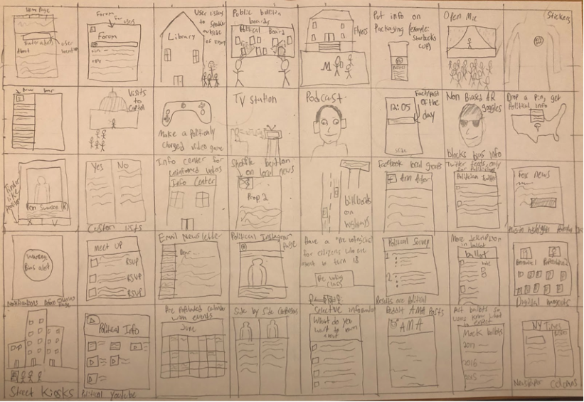
    Beginning the paper prototype for our local politics platform, we could initially feel a rising sense of unease growing. It was quickly becoming clear that we didn’t know as much about out platform’s functionality and structure as we initially thought. However, working on developing the paper prototypes unified our team by focusing our efforts around a concrete product. After a few short hours, we developed a clearer idea of how our platform will work to address the needs of our users.

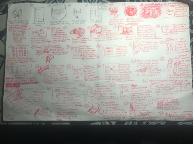
    Our process began using sticky notes and arrows to determine flow from screen to screen. On the sticky notes, we simply wrote the purpose of the screen, and avoided drawing any form of mockups. We purposefully took this part of the process to about 75% accuracy and completion, as we knew that changes would come about once we began creating actual prototypes. While it did not take much time at all, it did drive a lot of our prototyping process, and exposed the areas where inconsistencies existed across the minds of team member.

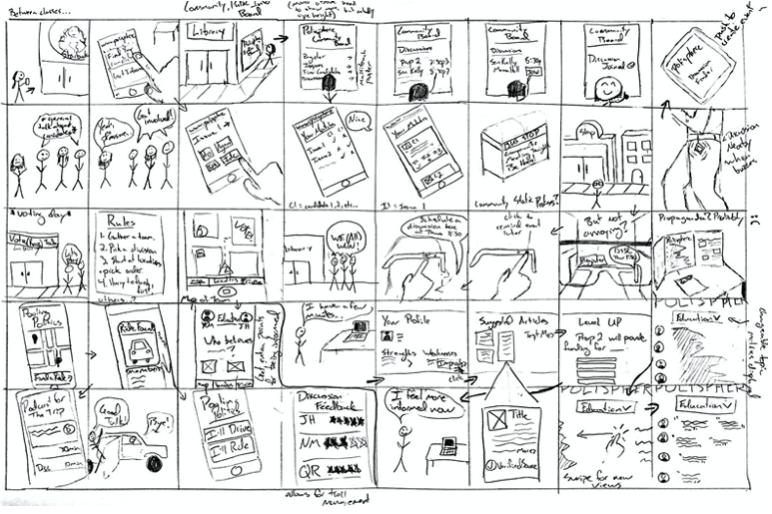
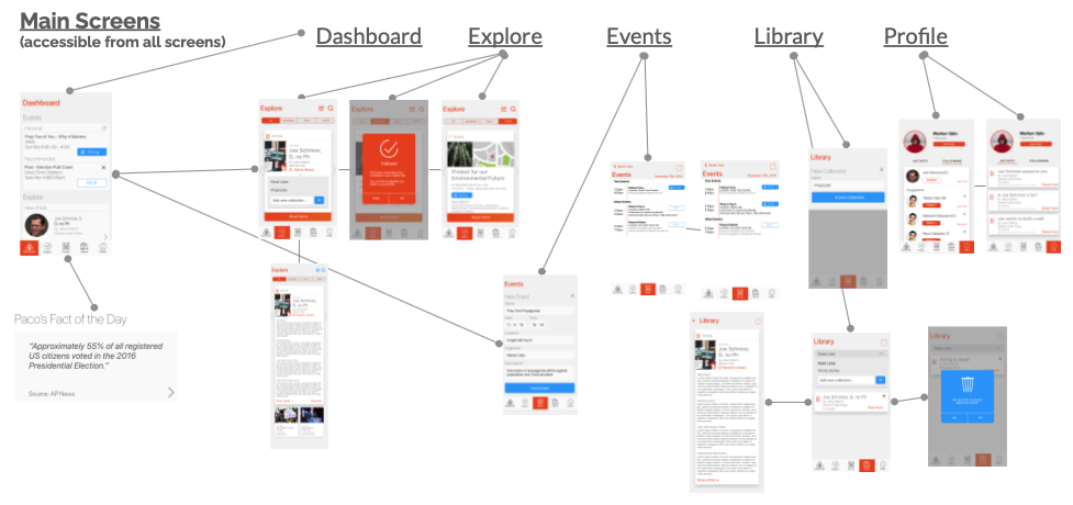
    From there, we split up the pages across team members, with one or two people being responsible for a section. This allowed smaller decisions to be streamlined without creating fragmentation across the whole app. Once our prototype screens were about 80% complete, we re-drew our feature flows, and determined which screens were needed to complete an interaction.

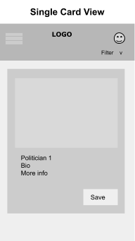
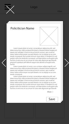
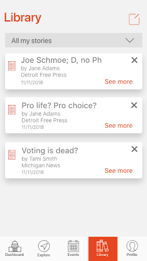
    After a complete flow has been established, we evaluated placement and consistency of smaller interactions across the application. This includes saving a candidate and accepting calendar invites. Such interactions are relatively simple, but need to be recognizable and actionable. Due to the nature of the low-fi prototypes, more of our energy was directed towards determining logical flow from screen to screen than some of the smaller mechanics.

    Overall, the paper prototypes unified our team’s ideas and gave us a more comprehensive idea of application-wide goals and interactions. In future iterations, we needed to dive deeper into some of the smaller interactions within screens. We could not have arrived at this point, however, without the progress the paper prototype allowed us to achieve.

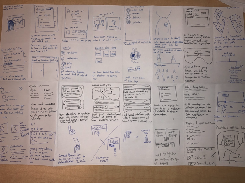
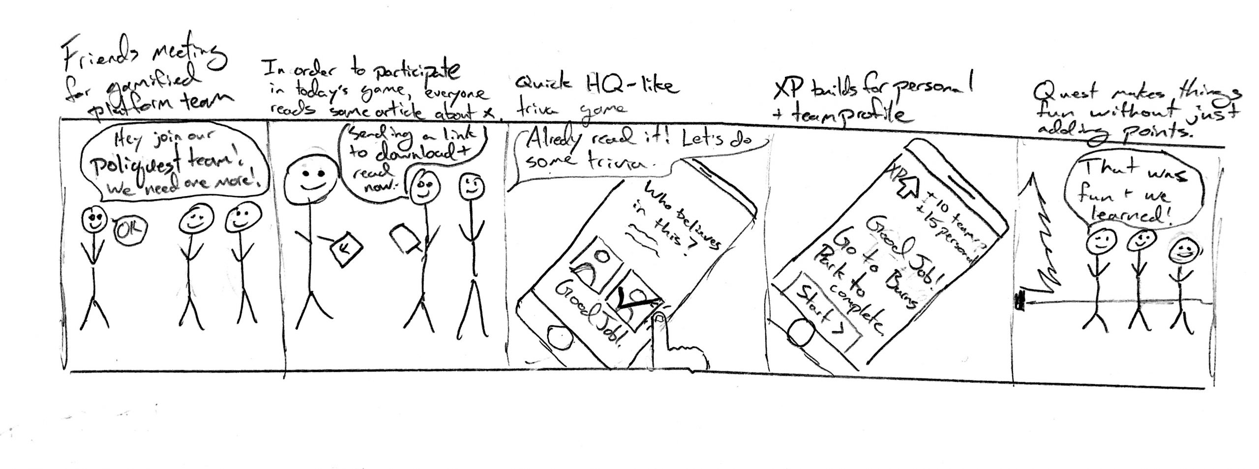
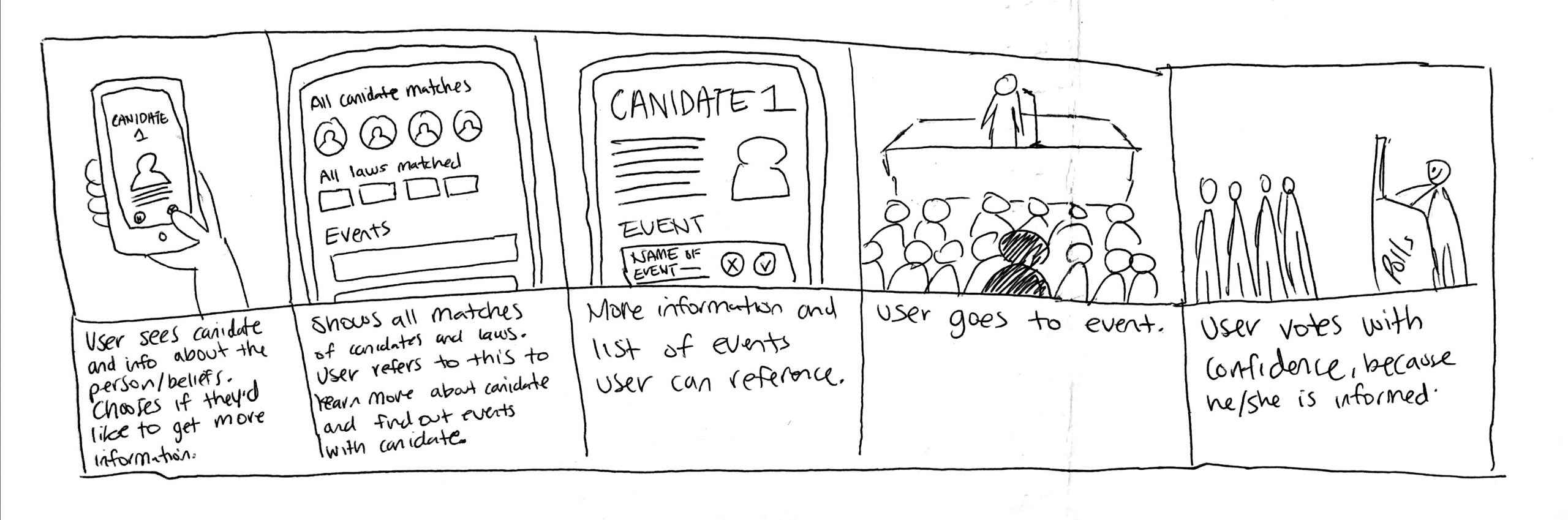
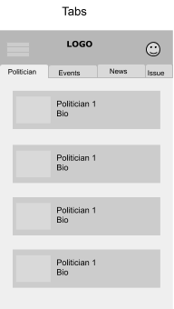
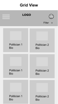
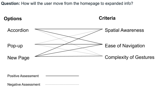
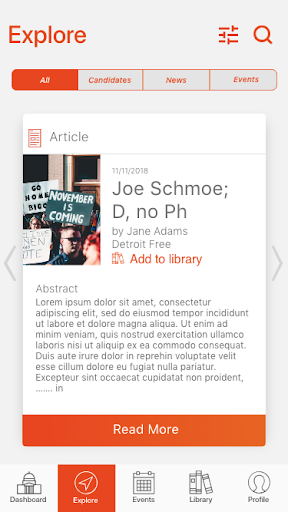
    Some of the design decisions that were made as a result of the prototypes were refining the home screen and making finding new information as easy as possible. These were based on information from our personas and scenarios that developed earlier on.

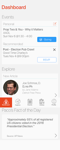
    We decided to change the initial page/home screen to more of a navigation dashboard than a feed. We determined a feed could be too overwhelming for some users that don’t know exactly what they want to do or can do. A navigation system at launch allows the user to have more control over what they want to do, and also presents the full functionality of the app in a more digestible way. Users can get a preview of their events for the day, view daily facts on politics and see their saved instances with the dashboard.

    Improvements could still be made to this page by highlighting the most relevant information to the user. A more nuanced understanding of this could increase the utility of the home page. This may also evolve as users become more familiar with the platform. We also decided to focus on managing events to foster community interaction and finding new information/candidates. Zeroing in on these actions more clearly defines the purpose of the application and streamlines the processes, making them more likely to be used.

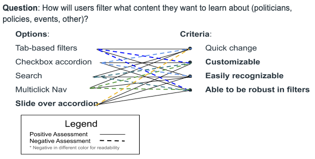
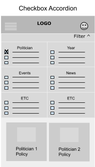
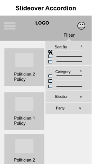
    This area still needed improvements for future iterations. For instance, we needed to understand how filtering instances of information would affect the structure of the app. Will the users get confused by the filter options? Are they intuitive filters? We also needed to know if the flow of the application was understandable and useful for the users. There may be a feature integrated to help match users to candidates or proposals that they could find interesting. Along with this, does our application solve the overall issue of “weaving the gaps” within the community? By understanding the answers to these questions it helped us to further develop a more exciting, inclusive, and educational application.

Digital Prototype

Prototyping Tool Decision Making Process

    Prototyping tools are incredibly important when developing an application because it allows designers to visualize their products to potential stakeholders. In our efforts to find the best option for us, we tried out Invision, Invision Studio, Figma, Adobe XD, and Sketch. We had certain constraints as well that limited what individual group members could use. For instance, one of our members had a PC, and most members weren’t willing to invest money in a tool. These constraints allowed us to eliminate specific options such as Sketch and Invision Studio.

    We decided to use Adobe XD because it was free and accessible to all our members. While using XD, we realized that it didn’t have a completely intuitive design. For instance, placing images into the editor was referred to as “import” and cropping images was done with creating masks. There were confusing elements, such as creating a symbol and modifying the same elements without changing the original. On the flip side, we liked that we could put together our screens’ interactions within the same application. This made the process of creating a complete prototype easier. However, we wish the application was collaborative, so we could all work on the app and increase our workflow productivity.

Building a Mental Model

    The iterative design process has a way of exposing entire areas and interactions that the design team seemed to miss. Our first digital prototype was no different. Upon demonstrating it to a few outsiders and giving them a few tasks, it became clear to us that the meaning of many actions in the explore section was muddy. We had vague buttons that alluded to yes and no. Still, We did not allow the user to perform bottom-up processing and hypothesize what these actions would result. As a result, these actions could also feel unsafe. Furthermore, exploration techniques were convoluted and unclear, resulting in reduced functionality of a pivotal feature. 

    We realized that many of these issues were because we did not have a clear mental model of what “yes-ing” a card entailed (see, we didn’t even have a good name for it). We realized that saving an article for later reading would have different meanings from saving a candidate, which would presumably want to stay updated with and follow over time. As such, we decided to clean up the semantics of our action items. Articles would have “Save for Later” buttons and the opportunity to see similar articles right away. Candidates would have the option to “follow” to them, later accessible from the user’s profile. All cards in the exploration no longer have the “Yes” or “No” buttons, as it was unclear how these fit into the mental model. Using more specific semantics helps the user recognize what’s going to happen.

    In combination with a new filtering option, getting rid of the “Yes” and “No” buttons also made navigation cleaner. Multiple users gave us feedback that it was unclear what clicking “No” on a card meant. We made it so that users could simply swipe to and from cards, and there is less of a sense of permanence with moving past a card. A multi-selection tab filter at the top of the screen continually informs users that they can see articles, candidates, or events. This carries the affordances of giving continuous feedback and giving the user more control and filtering unwanted information.

Final Prototype

Application Flow Overview

Main Screens

Stand-Out Factors

  • The premise of our application itself; there are no mobile applications as accessible as ours that address the same problem in a political context.
  • Library collections are easy to create & update, and allow for robust management of news articles.
  • Follow Message appears only the first time a candidate is followed. This informs the user but doesn’t berate them.
  • Explore filtering tab allows for direct access with a single tap.

5) Final Takeaways

Impact

    Ember can mobilize citizens and empower them to take the initiative regarding their local politics. We also believe there is a significant possibility of this spilling over to a general increase in political activism.


    Focus on local events and news can help instill a greater sense of community and responsibility in individuals. Equal ability amongst al users to create events distributes power more equally. 


    Finally, we believe the affordance of ember indicates to users that it is merely a tool. We want to turn the focus away from digital “activism,” and shift the focus back to real events, people, and impact. 

Future Ideation

    When we were brainstorming ways to engage the community, we thought of ramifying the app and incorporating AI/VR. However, as we were developing the application, we realized that our understanding of our application wasn’t fully developed, so focusing on making a fun/engaging interaction started not to be a priority. Given more time, we would incorporate gamification by giving the users quests to do with the Ember community. These quests would involve using augmented reality to make the user find information within their community. For example, if a user points their phone at a city park, a quest would pop up on their screen and ask the user to find/collect the new information from that location. The information could be a recent bill that is effecting that park or a simple piece of voting material. Based on the users’ ability to complete a quest, they would receive points and be able to use them to redeem prizes. To further develop community engagement, we were also thinking of having team-based challenges. With a team, the user can complete to finish a quest and earn more points.

What We Learned

    We used Adobe XD to prototype all of our material and initially divided the work to focus on the three main screens: the dashboard, feed, and calendar. Although this approach worked by promoting everyone’s idea of the application, ti on the contrast split out collective efforts of understanding the app. For a long time, we were all frustrated by what the apps core functionality would be because we didn’t brainstorm solid ideas before prototyping. This lead to wasted time in prototyping unused screens and limited our overall scope of the app. With a team of six people, if we were all on the same page earlier in the design process, we could have developed a more robust app.