FriendsLearn Inc. | Fooya! App

User Research, Mobile App Design | User Experience Design Capstone (University of Michigan School of Information)

Project Overview

Executive Summary

    1.5 million Americans are diagnosed with diabetes each year. FriendsLearn is a startup striving to stop this epidemic by influencing kids to make healthier decisions via its mobile game Fooya!. The problem addressed was FriendsLearn’s desire to understand its target user base. The team addressed the problem by interviewing children to identify user needs. The team then conducted qualitative coding, persona creation, and affinity mapping. It used these findings to design and implement navigation assets in Illustrator and Unity. The team hoped that this work would encourage kids to engage with the app to lead healthier lives.

Client's Mission

    FriendsLearn Inc aims to decrease the spread of epidemics that can be influenced by lifestyle choices. Through personalized, gameful digital therapeutics, it wants to redefine the space, so video games can play a role in helping the next generation make healthier decisions.

Project Description

    To more effectively reach its users and maintain engagement levels as their exposure increases, FriendsLearn Inc was looking to understand better its active and potential user base on their mobile application Fooya!. The primary user base of the application is composed of elementary school children between the ages of eight and ten. 

Project Goals

  1. Identify the factors that drive user engagement. 
  2. Explore game mechanics that contribute to or detract from usability.
  3. Align navigation and control with user mental models to remedy existing control errors. 

Final Deliverable

    The team created design assets in Adobe Illustrator for the screens that needed to be re-designed, so the client could easily map into Unity. From user testing of our re-designs, we saw that the median action search time was reduced by 15%, and overall comprehension of the game increased by almost 100%.

The Team

  • 2 UX Researcher
  • 2 UI/UX Researcher and Designer

Project Timeline

January 2019 – April 2019

THE PROCESS

1) Project Background

Project Background

    FriendsLearn’s CEO Bhargav Prakash shared the inception of Fooya! with the student team during one of the first meetings. When his young daughter played on his phone, he became acutely aware of the onslaught of advertising, pushing unhealthy foods on young children. He wanted to create something to combat this and reach kids more effectively than junk food companies.

    Though many industries have recently seen significant changes influenced by technology, the large and policy-laden healthcare scene has been slower—this approach into personalized art of medicine into scalable programs. While some companies are working on these products for pre-existing chronic illnesses, none of them currently address diseases caused by lifestyle choices.

    FriendsLearn faces a few unique challenges. In a relatively unexplored market space, they are attempting to help solve one of the biggest health concerns this part of the world has faced over the last few decades (Besides Covid-19). It believes it will be most effective over time by reaching young children. While true, the project teams must also consider the challenges this brings. As revealed in expert interviews with a physician and a game signer, many children’s health is often determined for them by their parents. Furthermore, the game has to be challenging and engaging on its own, with intuitive controls and mechanics that facilitate long-term engagement. These points and the surrounding industry context was in mind throughout the project execution.

Project Goals

    This project aims to both understand the UI/UX elements of the Fooya!’s interface that have low discoverability and also to understand user engagement levels throughout the game to identify where engagement is increased and decreased. The team used this learning to achieve its primary goal of increasing user engagement and user retention.

    At the start of the project, the team thought a secondary focus would be to assess and make design recommendations for the parent sign-up flow that FriendsLearn was planning on releasing. However, this sign-up flow was never made available to the team, so all efforts were focused on the primary goal.

    Therefore, the team’s secondary goal transitioned to laying a foundation for a successful multiplayer experience. FriendsLearn communicated that this is one of its long-term goals. So the team developed several design components that will help Fooya! in its transition into a multiplayer game.

2) Research Overview

Research Plan Overview

    Much of the information FriendsLearn wanted to get from this research was much more qualitative than quantitative, in regards to the effectiveness of Fooya!. The team chose to use research methods that expose how users feel while engaging with the application, with the goal of a better understanding of how this application could be designed to suit their needs better.  

Research Goals and Questions

    To arrive at a stable conclusion for understanding the two main project goals, the team constructed a set of questions to direct the research process.


Q1: What are the factors that contribute to the usability and playability of the game that may hinder or encourage further engagement from the user?


    Answering this question helped the team evaluate the current status of the features and UI elements in the game and better understand its impact on users, particularly on users’ engagement levels. This was achieved by observing the interviewing the users in the context of their use of Fooya!.


Q2: Are there any features that users are not utilizing? If so, are the users able to discover and understand the function and purpose of such features in regards to the way they interact with the application?


    This helped the team understand two things. First, it helped to understand better which features are being used less than expected. Asking the second question helped the team understand why this feature might be underutilized and how it could be further improved to add to the overall user engagement levels


Q3: How do market competitors achieve high levels of engagement, and how can this be applied to Fooya! app?


    Understanding effective architecture and design patterns in successful competitors allowed the team to further their understanding of best use cases of certain features, as well as potentially accessing how engagement levels could be increased.


Q4: How usable is the current sign-up process? What are the current obstacles that may potentially hinder a fluid user experience?


    Answering this question allowed the team to evaluate the effectiveness of the current design and gave the team a basis for understanding the usability of the current sign-up process and its design and information architecture. 

Research Methods Overview

Method

Purpose

Methodology

Materials

Reading on Pertinent Topics

Understand digital therapeutics landscape and the cognitive abilities of elementary children

Internet reading found by out team and readings provided by client. 

Competitive Analysis

Understand the competitive landscape and market landscape to inform set of requirements

Split companies into direct, indirect, niche, and innovator competitors by comparing the number of market spaces and features that each company claimed to be in and have that are comparably similar to FriendsLearn’s application Fooya!.

Company Websites

Heuristic Evaluation

Gain preliminary understanding if features violate basic usability standards

Used Nielsen’s Ten Usability Heuristics to follow industry standards and conduct baseline analysis. Future chose Korhonen’s Mobile Game Heuristics to analyze from a gaming perspective.

Published Sets of Respective Heuristics

User Interviews

Gain concrete qualitative data and insight into research questions

User interviews at AADL using simple language for qualitative questions. We prepared a set of questions and probes related to violated heuristics.

Camera and Voice Recorder

Code Interviews

Systematically identify patterns in qualitative interview data

Use transcriptions of the user interviews to identify patterns through a set of defined codes.

Codes: Confusion, Enjoyment, Pain Points, and Questions

Affinity Map

Confirm patterns observed in the data after coding

Display sentiments and quotes from interviews in a physical form to visualize trends across participants. Identify trends based on emotions and topics.

Post-it notes and a Large Wall

3) Research Analysis

Key Findings

Control

    User freedom and control are primary factors in maintaining engagement over time. Perceived control can be increased by reducing recognition over recall and providing navigation options in multiple menus. Control is also influenced by a player’s sense of long-term progress. This can be further improved with deeper integration of character upgrades and consistent updates of how immediate gains affect long term progress.

Consistency

    For users to fully immerse themselves in the game, it is imperative that styling is consistent. This allows for more straightforward navigation and lowers cognitive processing times. There are multiple areas in Fooya! with varying styles that need to be addressed. 

    All team redesigns are consistently styled within themselves. Furthermore, a style guide has been provided to detail these changes. It is recommended that this style guide be updated and modified as needed for future development.

Competitive Analysis

    A competitive analysis was conducted to better gauge market competitors of FriendsLearn’s application Fooya!. The team researched other companies in the market spaces of Health, Lifestyle, and Gaming. From this research of companies in these market areas, we separated them into direct, indirect, niche, and innovator competitors. When looking for direct competitors, we looked for companies that also were in the space of digital therapeutics and doing digital health interventions. For indirect competitors, we determined them to be more specialized in helping people live a better lifestyle. Niche competitors had one or two features that were similar, like gaming, which competes for the same market demographics attention. Lastly, we determined innovators to be companies taking a unique approach to improving the human condition.

    Once a comprehensive list of companies to analyze was composed, we determined features to compare them. The first two features, Treatment, and Monitoring were determined by researching another digital therapeutics company called Akili Interactive, which showed that this company focused primarily on the treatment and monitoring of patients. We then broke down the feature Treatment into Gamification and Learnification and Monitoring into Self and Parent/Caretaker to compare the rest of the companies. Next, we used the feature Engagement with the attributes Ideal Time Usage and Engagement Context to see how long a company expects one of its users to be using their application and in what context. After we wanted to see what platforms each company’s apps were accessible by, either mobile, web, wearables, augmented, or virtual reality. Next, we compared the recommended target audiences, then compared the different cost structures of each competitor. Features and attributes were researched, and results were recorded in a Google Spreadsheet, as seen below.  

Screen Shot 2020-03-24 at 12.14.33 PM

Heuristic Analysis

    The heuristic analysis was conducted to give the team a beginning understanding of the application’s problem areas. This was completed with two sets of heuristics to have a more comprehensive understanding of the intricacies of Fooya!. One set of heuristics was focused around usability (Nielsen’s Ten Usability Heuristics), while the other was centered around mobile games (Korhonen’s Mobile Game Heuristics). These two evaluations were completed separately to distinguish their purpose more clearly. All of Korhonen’s Mobile Game Heuristics (There are many) were not used to maintain the proper scope for the project.

    Common user tasks were listed to assess violations and compatibility with the heuristics. The team then attempted to perform these tasks with the most recent version of Fooya!. Problem areas were noted and described when heuristics were violated. Severity was assessed based on the number of and extent to which these heuristics were violated. Priority was preliminarily assigned to problem areas based on the severities, which were further reviewed with the client to ensure proper alignment with their goals.

User Interviews

Recruitment Strategy: Interviews were conducted at the downtown Ann Arbor District Library to assess a random and voluntary population of users. Users were not solicited; a sign was posted indicating our study, and interested users approached the student team. A total of four testers participated. 


Target Population: All users between preschool age and fourth grade were accepted. Second graders were the target population, as indicated by the client, but no schoolchildren were turned away. Three out of the four participants were at or very close to the target age group.


Questions Asked: Questions asked were qualitative to get a preliminary understanding of the reception of Fooya!. Questions focused on daily habits, reactions to the game mechanics, comprehension of the storyline, and use environments. 

Themes and Insights

    Fooya! is in a strategic market position by being the first gameful digital therapeutic that addresses diabetes and other lifestyle diseases. The simple gaming intervention is natural for any child to pick up, play, and gain health benefits. Other companies in similar market spaces use more comprehensive health monitoring and gaming features that might help inform the decisions FriendsLearn makes when considering future features for Fooya!


Below are four main themes that the team sees as crucial areas for improvements.

  1. Increasing mobility and robustness of features for returning users
  2. Ensure long-term rewards and personalization features to incentivize the player
  3. More effectively introduced game mechanics and design more effective player control solutions
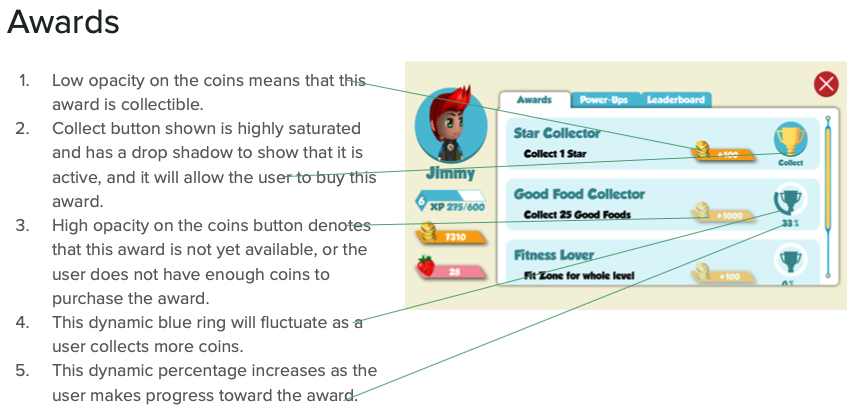
  4. Develop visual standards across the application that indicate desired affordances
 

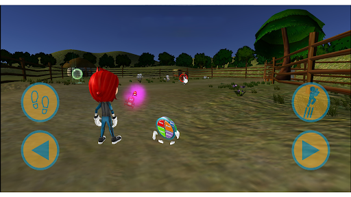
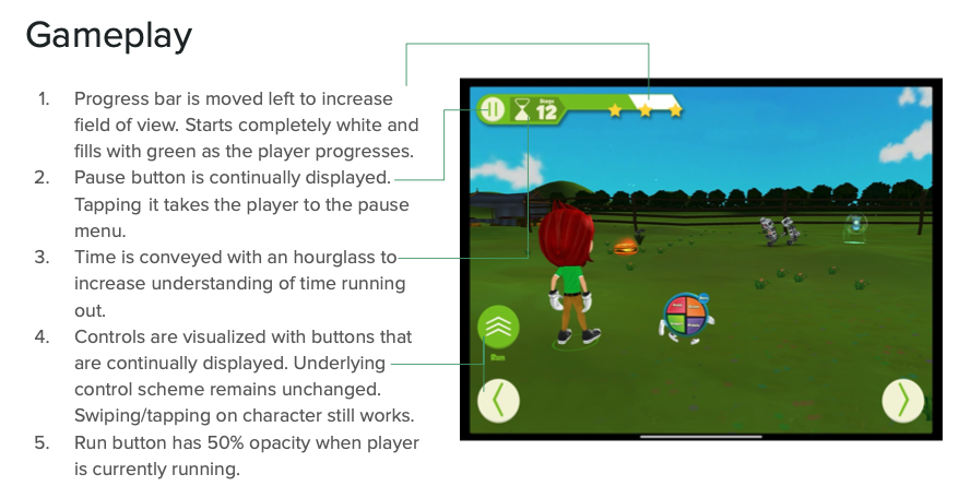
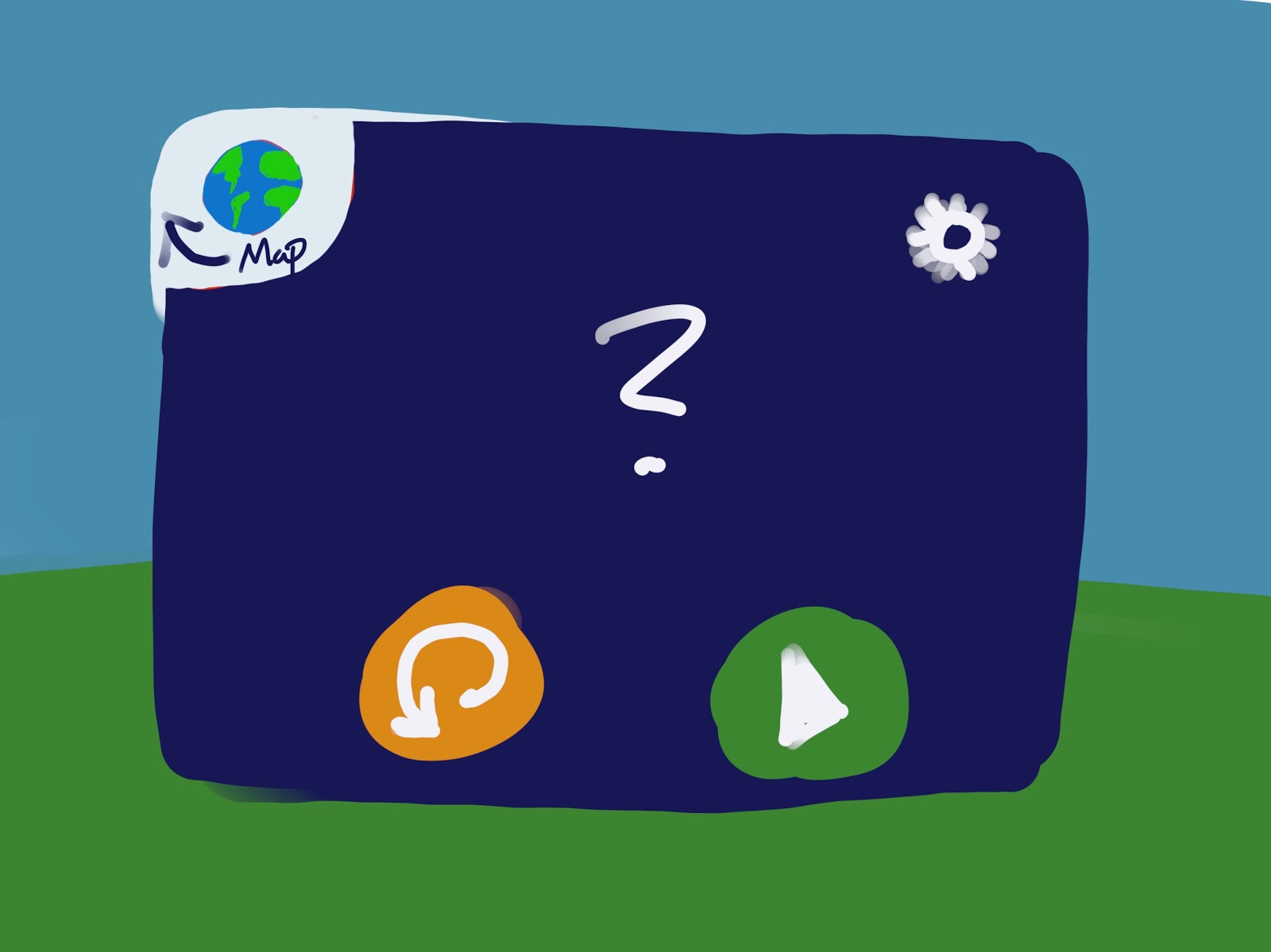
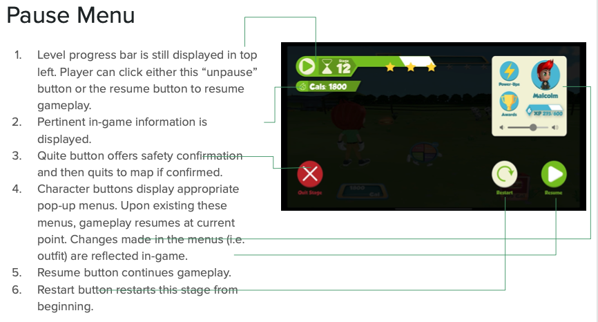
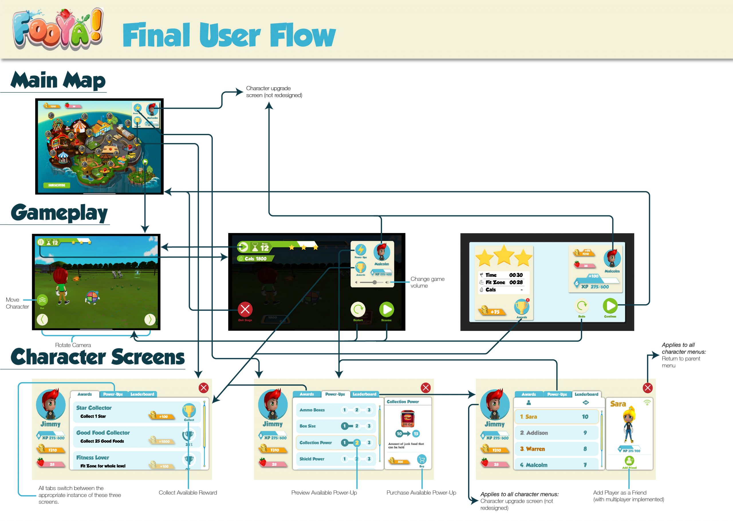
    There are multiple instances in which a returning user is punished by repetitive actions and large amounts of idle time. This is not acceptable, particularly in a mobile game, where users are much more likely to be interrupted than in other play environments (Korhonen). This manifests itself from a lack of an accessible pause menu during gameplay to an unnecessarily long loading sequence that cannot be skipped.


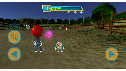
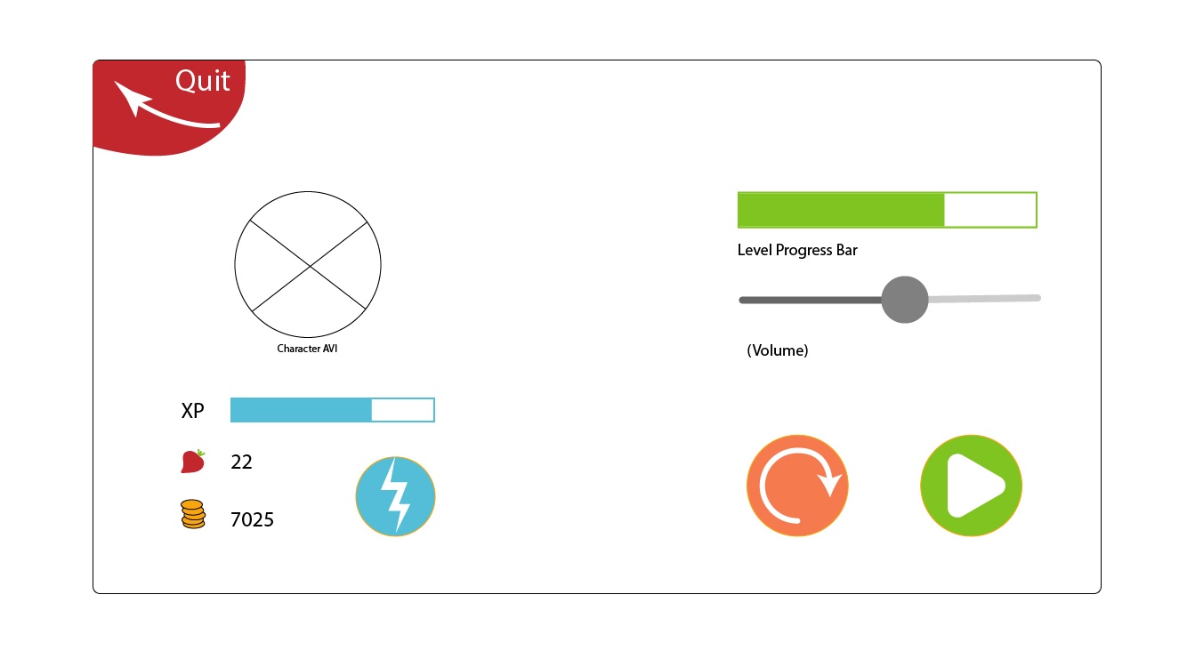
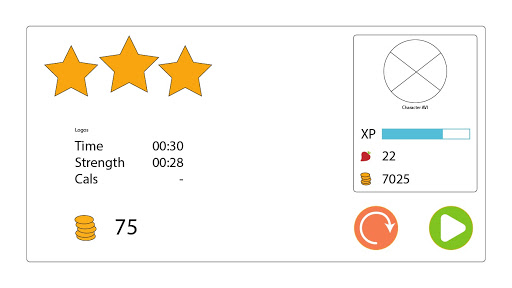
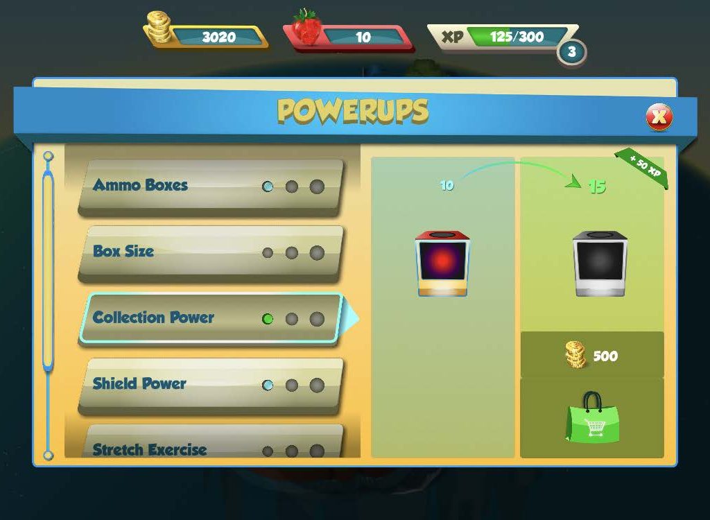
    In this vein, returning players need to be rewarded for their continued play, and Fooay!’s current mechanics need to be polished. Character upgrades, the primary way for users to spend their hard-earned coin, do not save between play sessions. This decreases the incentive to continue and, thus, the probability of long-term engagement. The client claimed that this and other back-end issues would be addressed in a future update.


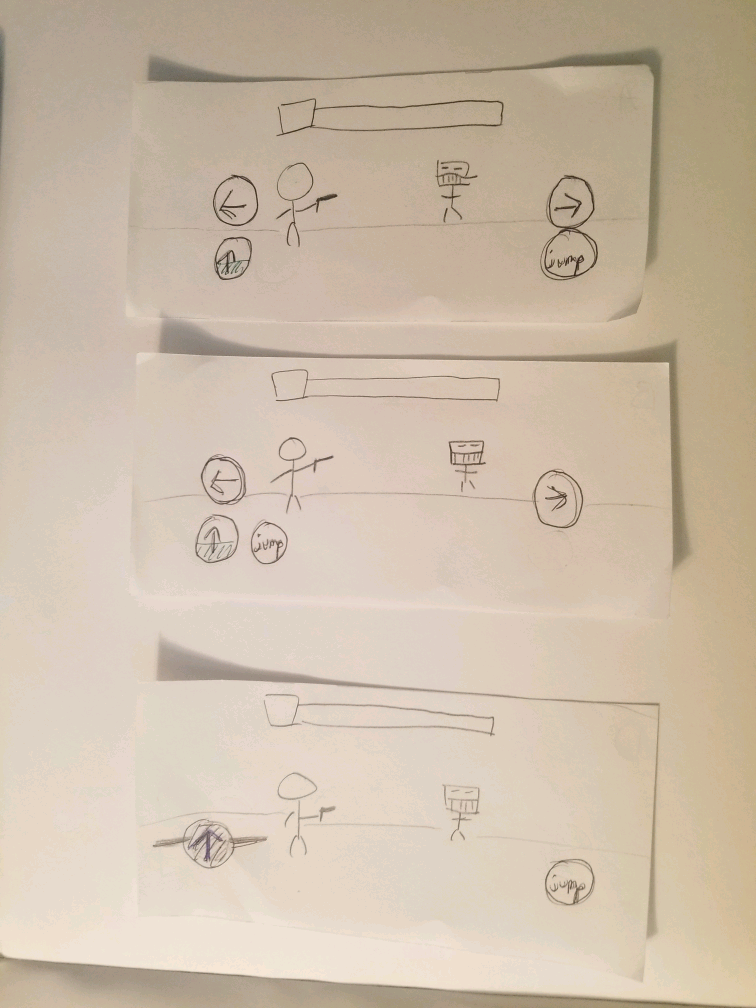
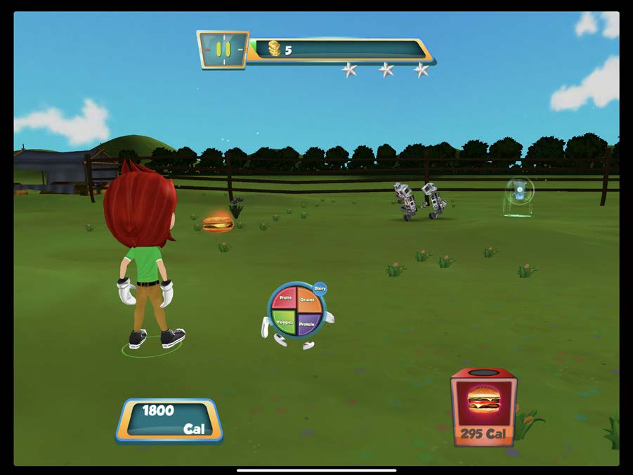
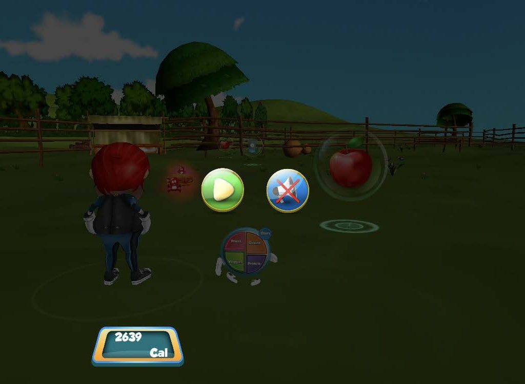
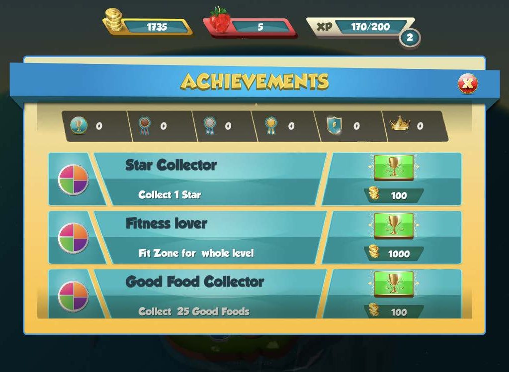
    As the game becomes more involved, new mechanics and items are introduced. In many cases, this is rushed and unexplained, reducing utility to the player and their ability to master the gameplay. In one user interview, a user was under the impression that they were “purchasing a new level” instead of gaining a new ability, demonstrating an extreme discrepancy between the user’s mental model and reality. Testing participants also showed difficulty effectively moving their character, which hinders interaction and causes built-up frustration in the gameplay’s essential section.


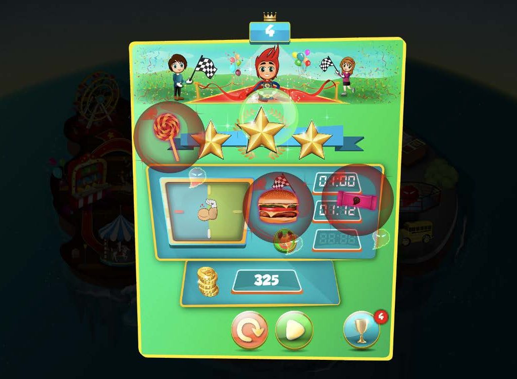
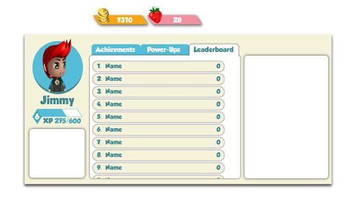
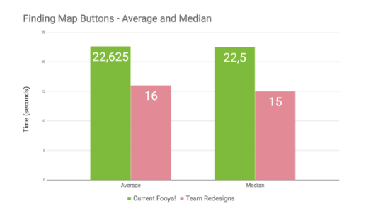
    Finally, Fooya! needs a more consistent style guide that is persistent throughout the application. Buttons have numerous shapes, colors, and sizes, dilating usability consistency standards (Nielsen). Selection states and navigation tools (i.e., scrollbars) also vary throughout the app. As a result, the student team often found the testers tapping haphazardly and without direction until something happened, or conversely, staring blankly at the screen.

User Personas

    Following the user interviews that took place on 2/3/19, the team created a primary persona from the data collected from user interviews. The raw recording of the interviews was transcribed and coded into several reactions, which was then re-organized into an affinity map, which helped us understand patterns in the user ideas, opinions, or issues. This data organization helped us create a user persona for our target user base, second-grade kids. First off, we identified our users to be very comfortable using mobile devices. However, they expect specific standards of interaction and will tend to become frustrated over time with the areas where Fooya! does not follow convention. As children often have limited screen time, this is particularly true with issues and loading screens that hurt the game’s mobility. It is primarily these mechanics and navigation models that could hinder engagement, as they generally find the story pleasing and fun. Similarly, they indicate a clear perception of the message of the app after playing.

Persona Scenario

    After playing outside for an hour with neighborhood friends, Jacob comes inside to his home. Since he just spent some good time being active, he knows his parents will be okay with him playing games for a bit until they have to leave for his sister’s soccer game. He only has about thirty minutes, but mobile games are usually pretty convenient, so he picks up the gamily iPad and open ups Fooya!.

    He’s played a couple of times before and is a little confused as towny he has to redo the introduction every time, but after a couple of taps and a few loading screens, he’s back at the map, so he jumps in. It’s been a couple of days since he’s played, and at first, he cannot recall how to move his character effectively. However, a few taps of trial and error remind him of what he needs to do, and he plays a few levels. The story is clear and engaging, and this is what keeps him invested.

    After completing a few levels, he decided to use some of his freshly earned rewards to upgrade his character. He buys a sweet new red hat for his character in the ship and some matching sunglasses. He’s proud of his upgrades because they took multiple play sessions to earn. At this time, his parents call him and instruct him to get ready. He closes the iPad and goes to prepare himself for his sister’s game.

    Since he got ready quickly, he had a few minutes before he has to leave, and he wants to use these to get back at the mean Fooya! Robots. Unfortunately, the app restarted, and some of his few remaining minutes are spent going through the same long loading sequence he’s seen multiple times. During this sequence, he notices that his character upgrades have been lost! Confused, annoyed, and pressed for time, he exits the application and opens YouTube, hoping to be able to find something entertaining before his parents tell him it’s time to leave.

UX Requirements

Requirements

Create robust mobility and navigation

Avenues

  • Reduce Loading time 
  • Save character upgrades between sessions 
  • Develop and refine pause menu 
  • Develop a system-wide style guide for buttons and UI elements

Impact

Increase support for tech-savvy players to engage with Fooya! more consistently over time.

Decrease system inconsistencies and lay framework for the future of Fooya! UX style and navigation system

  • Develop a system-wide style guide for buttons and screens
  • Collaborate with the existing game design team

Extend project impact beyond the existing timeframe and ensure the sustainability of work. Shorten design production time for FriendsLearn in the future. Reduce navigation errors for the users.

Improve gameplay mechanics and item integration

  • Storyboard/prototype item tutorials 
  • Increase hotboxes on certain items 
  • Develop potential control alternatives

Increase engagement with experienced gamers. Reduce confusion and learning curve for new players.

4) UI/UX Design Process

Process Overview

    Care was taken to align with the client’s resources to maximize the utility of the redesigns. This primarily meant staying within a reasonable distance from the existing structures while still finding avenues to modernize and improve them. Certain bounds that were observed include overall art style and underlying controls. Fooya! maintains a consistent 3D skeuomorphic approach to design, and these bounds had to be visually observed in redesigning facets of it. Similarly, while the controls needed attention, modifying the underlying structure was out of scope for this project.

    To address the various user pain points throughout the application, the team divided redesigns into four main areas: Style Guide, Control Mechanisms, Primary Menu & Map, Skill Tree & Achievement Menus, and Loading Sequence.

Style Guide Creation

    To help increase the sustainability of this project, the team prepared a style guide detailing the redesign. Even if some of these changes are not followed in the future, the team hoped that the very presence of the style guide would provide structure for UI consistency in the company’s future. This is also to ensure changes can be implemented more efficiently after the conclusion of the student project.

    It was first crucial to establish a color palette. Instead of reinventing the wheel, the student team pulled colors from Fooya!’s existing logo. These colors are notably underrepresented throughout the application. In addition to keeping branding strong, it also reduces the need to introduce additional colors into the scheme. This keeps the consistency higher and allowed the team to establish semantic meanings to some of the colors. For example, the blue button should exclusively refer to actions regarding the player’s character. (A full list of semantic meanings can be found in the style guide)


    The process of the Style Guide’s creation was very closely tied with the creation of the primary maps and menus. During this process, the standard for buttons was developed. A/B tests with 6 participants proved that the team’s redesigned buttons with “drop/shapes”/shadows appeared more tappable than the existing buttons, whose key unifying feature is a surrounding yellow border.

unnamed-9

Current Button Style

pasted image 0

Redesigned Button Style

    In some cases, style requirements were defined before associated menu designs were created. This created situations that allowed the UI to be focused on adapting to the requirements instead of bending the criteria to fit one design. One such example includes the button margins; the required minimum space was defined before menus were created. After, all menus had to adhere regardless of their visuals, and therefore the design spaces narrowed while maintaining critical requirements.

    Defining the style guide proved to be a beneficial and informative part of the process. With this methodology, once one button was established, they were all defined; one had to pick a color from the determined color palette and chose an applicable label. 

Control Mechanism Redesign

    Based on the research results, the team began to explore designs for the control mechanism to make it more intuitive, easing the learning curve and reducing confusion. The process involved three phases of additional assessments and research, preliminary designs and validation, and final designs of control options.


Controls Research

    Since the team did not have a strong understanding of game design, we decided it would be best to take some time to research how controls can be refined to make it more intuitive. During this process, the team went back to the video recordings of user tests from the research phase to view finger positioning and motor capabilities, since the target audience of 2nd graders does not have the same motor abilities as grown adults. The team also took time researching control conventions as well as assessing competitor controls. This involved looking at other TPS (third-person shooter) mobile games. While not regularly a part of different design processes, this process was crucial because the team felt like it was essential to find a control design that would be easily learnable and sustainable over long-term gameplay. As a result, the team discovered that for the UX requirements, it would be best to direct the controls for the character’s actions to a couple of buttons rather than their current design of utilizing full-screen swipes and tapping on characters to move forward or to jump.

Low Fidelity Designs

    The next step involved a preliminary round of designs and validation. Since we presented a whole new mechanism for controlling the character that would require a complete redesign of the underlying mechanics, the team decided it would be best to keep the core control mechanisms while just changing the user input methods. For instance, the team decided to keep the current forward movement mechanism, which currently can be activated by tapping the character a certain number of times, until the character is tapped again. An alternative idea to this was to change the input method from tapping the character to tapping a forward button and giving a clear indicator of how much more time remains in automatic running. Therefore, the team created three basic lo-fi paper prototypes with buttons that would allow for four different types of input: Moving the character/camera left, moving it right, forward movement, and jump movement.

    The lo-fi design variations were created to test a couple of concepts, like prioritizing the button positions. For instance, one change between the designs was the left versus right positioning of the jump button. Due to the difficulty of creating an interactive game with paper prototypes, the prototypes themselves were phone-sized paper cutouts that yielded no interaction. They represented the button placements and the gameplay to allow the subject to better imagine playing Fooya! during the validation process.  

    Both lo-fi prototypes A and B use a left and right button to control camera movement/character direction and the forward movement button on the lower left side. The direction to put this button on the left side came from the mobile gaming convention of putting character movement buttons on the left side. This convention is usually completed by putting action buttons (attack, defense, skills) on the right side. Since jump is the only action available, but since it is also a movement button, the team ran into a dilemma between having the jump button on the right and left. The variation between A and B was created to see, which would be more comfortable on the hand and more intuitive. 

    Low fidelity C was created as an alternative control scheme. Rather than controlling the camera/character direction with left and right buttons present in A and B, design C changes those directional inputs from buttons to a joystick-like movement. This would mean that the forward movement button would be dragged left, right, forward, and back instead of merely right and left with the buttons. This was ideated to explore a variation that is more commonly used in mobile gaming.

Lo-Fi Design A (Top), B (Middle), and C (Bottom)

Low-Fidelity User Testing

    These designs were then validated with six different college students who were asked to hold the sketches and imagine interacting with them. The testing proved that Design C was difficult to understand and that Design B felt uncomfortable since buttons were cluttered on the left.

Mid-Fidelity Designs

Mid-Fi Design A

Mid-Fi Design B

    Based on preliminary iterative validating results and comments made during the tests, higher fidelity designs were created. This was based on the lo-fi Design A. We switched the left and right directional input to the bottom and the action to the top. This decision was made due to recurring comments regarding the higher comfortability of putting the buttons below.

    Options for the jumping action input were further explored to more closely replicate the behavior encouraged in the current control scheme. Since the current design implemented in the game encourages users to swipe up on the character to jump, the idea of swiping on the only active movement button – the forward movement button – was implemented into this design.


High-Fidelity Designs

Before

After

    To increase mobility and consistency, some of the main menus required an update. This redesign process mostly informed the creation of the style guide, and style changes were verified to work across different areas of the application.

Early Ideas

    Based on research questions related to the perception of icons and watching users attempt to navigate the main screens, it was clear that more continuity and user control was needed within displays related to level starting, pausing, and completion. Multiple users could not correctly identify the meanings of existing semiotics and had trouble efficiently navigating and selecting the button they desired. Therefore, it was clear that these screens had to be redesigned.

Low-Fidelity Designs

    One of the first approaches was to redesign the pause menu, as it violated numerous heuristics and does not improve the user’s control as much as it should. We started knowing at the very least that it should provide the option to quit or restart, but did not know much beyond that at the beginning stages.

    From here, the team asked the options of peers and young gamers, with questions to what a pause menu should contain. The research was also done by observing existing conventional systems in games. The findings from this were used to inform the following wireframes.

Wireframe Designs

Pause Menu

Level Complete Screen

Wireframe User Testing

    Testing with these mockups was conducted by asking peers and target age users (second graders) their interpretations of the icons, where the user-perceived themselves to be, and ease of access to each element. General findings indicated improved control but still some ambiguity surrounding specific semantics. A good example is the “Quit” button on the pause screen. The direction of the arrow is ambiguous, and it does not follow the standards of other buttons on the screen.

High-Fidelity Designs

Before

After

Before

After

Level Map Redesign

     While the pause menu was being developed, the refreshed level map was also being developed to ensure consistency and compatibility with colors and sizing throughout the game. The layout was the main focus on this screen. Below is the existing layout design and two of our re-designed layouts with the final UI elements

Existing Layout

Redesign A
("Square" Character Module)

Redesign B
("Stacked" Character Module)

    Based mostly on composition, the team recommended the “square” character module versions. This is also more reproducible in other areas of the application, where stacked version is not. A/B tests between the two show no differences in perception of meanings. We also discussed implementing different module versions on various devices (i.e., the stacked version may work better on a phone screen than a tablet, as phones have a wider aspect ratio).

Final High-Fidelity Design

Skill Tree & Achievement Menus Redesign

    The purpose of designing a proper skill tree or achievement menu was to increase user engagement with the game’s progression. Currently, the achievements, power-ups, and leaderboards are loosely connected to the game’s progress, which creates a disconnect between the user and their in-game character. If the visibility, accessibility, and understandability of these elements are increased, users will establish better mental models of what they need to accomplish within the game, and how the overall game progresses.).

    The current screens lack continuity between them and lack clear indications of game progressing actions. They also suffer from sizing issues, which render some elements too small on mobile phones. These were key points to address when creating new versions. Clear visual affordances, like scroll bars and placing elements halfway below the fold, give the user a sense of direction when navigating through these features of the application. Iterations were also focused on clear continuity between the possible tabs. Consistent affordances were needed to show that something was in progress, available, or completely unavailable. 

    We began designing theses screens with low fidelity paper sketches to test out our ideas. Then we recreated the sketches as mid-fidelity prototypes in Adobe Illustrator. Finally, we made high-fidelity iterations that were consistent we the style guide that we created. 

Lo-fi Sketches

Mid-Fidelity Designs

Award Redesign

Power-Ups Redesign

Leaderboard Redesign

High-Fidelity Designs

Before

After

Before

After

Before

After

Final User Flow

Loading Sequence Redesign

     The original loading sequence takes ~1:35 if the user skips the introduction video. This time is mostly due to animations and extra screens. Our prototype cannot capture the complex animations of the original game, but we demonstrate the three screens that should be present in the loading sequence. All others we recommended to remove.

Original Loading Sequence

Recommended Loading Sequence

5) UX Validation

Methods

    The team conducted between-subject A/B Tests to validate our designs. In test A, eight people were asked to complete tasks in the game using the currently existing screens. In test B, a different set of eight people were asked to complete the same tasks in the game using the redesigned version of the game screens. These tasks were analyzed according to completion time, confidence level, and comprehension level.

Participants

    The 16 participants ranged from ages nine through twenty-three, with a mean age of 21. Test participants were not representative of the target user population of users between the ages of 8 and 10 because the team could not schedule a significant number of test sessions with this cohort. However, this data still yields valuable insights and validates the redesigns under baseline UX principles.

Key Findings

Screen Shot 2020-03-31 at 2.28.49 PM
  1. Across all 16 tests, it took users less time to complete tasks when shown the newly designed screens. Task completion time decreased by a median of 15%.
  2. Comprehension levels also increased across functions. This indicates that users are more likely to understand Fooya! as it is portrayed and can focus more on gameplay.
  3. Comprehension levels measure correctness, while confidence level measures speed, enjoyment, and certainty. Confidence levels must increase drastically, because many user doubts around this game have been decreased, and they are more likely to explore.

6) Final Deliverable

7) Final Takeaways

Further Research

    The team recommended conducting more validation studies with users in the target demographic population of the application since the team was not able to do this due to logistical constraints. The team provided an example usability/validation script for guidance. This, we hoped, would help further verify the validity of our design suggestions.

    FriendsLearn could also conduct user interviews on the multiplayer version of the game that contains the new parent-sign up, which were game components that were mentioned at the beginning of the project. 

Design & Functionality

    FriendsLearn can focus specifically on the character upgrade scheme, working to make style consistent with the newly provided style guide and correcting some HCI errors, including

  • Scroll bar use and style 
  • Selection state style and implementation
  • Eliminating the need to purchase different skin tones

    It was also recommended that the application architecture be updated to allow for live updates of power-ups, character outfits, and collected awards within a stage. While this will likely be a large amount of development time, the team ultimately believes the future-proofing and more robust interactions gained will be more than worth it.

Implementation

    The team packaged all design entities so that they can be easily mapped to sprites/prefabs in Unity. The Lead Designer informed the team that this would be the best way to hand off materials for easy future implementation.

Impact

    The team hopes that this project work can help Fooya! grow increasingly effective as a mobile platform striving to eradicate the diabetes epidemic, one child at a time.